Middle of the month with all its bits and pieces…
It’s the middle of the month. I have basically finished “And He…” several 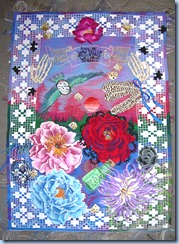 days ago. it’s sitting on a table waiting to be finished.That’s what i mean
by basically-the weaving is done. “It” at this point has no place to go. So it can wait!
But, life and the reality of timing have me setting it it aside to work on 3 small tapestries designed around the
words line and mark. The series will probably end up being 5 pieces of 5 by
7 inches. What a relief!!!!Haven’t 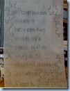 decided on the size of the 4th one. It may be 2 inches by 7 inches. If it decides to be that small I will design a 5th piece so that
the small piece will be a center piece. I would like to eventually hang
them together. So there will need to be a visual balance of size ad shapes.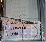
I have become fascinated with the idea of the what is the difference between
a line and a mark. Line to me is a expression of geometry and very little else. Line by
definition can be real or imagined, shortest distance between two points. By
 dimension and definition it has a beginning and an end at point A and point
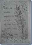
B. While a Mark is something that leaves an impression of something on some
thing somewhere and defines something in some way. okay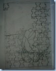 that said. The first
two pieces are about definitions. Each piece defines a word-mark or line.I am
about a third of the way done with line. The background is based on the sea,
fog and the delicate muted colours of a sunset. Another design that is
going to be difficult photograph. The grey and the complementary contrasting colours
will make look grey when translated into a photo. A lot like “Home” with its soft muted orange and blue sunset. Mark is the second and will have an intense sunset or scene in the background. The third which 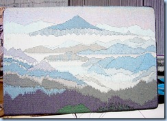 doesn’t have a tittle yet will be layered lines of a pale white/pink single layered rose from my garden and puzzle pieces that moves from lines through a transparency to a solid flower partially overlaid by jig saw puzzle pieces that are transparent wit an intense sunset/seashore as background. Now it’s time to weave it all. The cartoons of the pieces are my vellum cartoons that the transparency of the vellum makes difficult to photograph.
ZEUS and springs that spread an elegant solution.
Left over from 9-1-2012
Note– the spreading difference of the warps created by a spring that stretched more or less in different areas-should have been 20 epi, but was between 18-23 wpi. 
Donna Graham sent me this elegant solution to the problem of spread springs. Yes I did ask permission to use the photo and her e-mail message that she sent me. I, too didn’t like the changing epi which comes from using the spring on the mirrix. To fix this problem I switched to using 1/4 inch all thread. Since I work at 10 epi, the fine thread is what I use. It has a thread count of 20 per inch. Standard thread has 16 per inch.
custom cut the all thread to fit in the top channel where the spring went. Use a nut to de-burr the all thread by running the nut up and down the length of the all thread. Then take steel wool to finish smoothing out the all thread. Wipe down the all thread, feeling for burs. Repeat until the all thread is smooth. Screw a nut on each end to keep the all thread from falling into the channel and tape into place.
I also start with a bottom all thread without the nuts. I just line it up with the top and tape in place. When I move my tapestry around the lower bar I remove the bottom all thread.
I have not had a problem with the all thread cutting my warp thread. Just make sure the all thread is clean and smooth. I use this method on all of my mirrix.
One more note. If you can find the 3/8 inch all thread and nuts that would work better for the top spacer.Donna Graham
As promised-Combining 2 forms of optical blending with
other things-hatches, hachures, pick and pick(demi duite).
Yes! you can combine chene’s, colour fades, pick and pick and mélanges with hatches, hachures, pick and pick(demi duite). By the questions I am being asked and various statements I hear I think the confusion stems from the fact that many of the multiple tapestry traditions in the US and other places are based on the use of singles or one yarn in the weft bundles(does one take a plural in this case?).
By using multiple strands of weft in your bundle you can effectively change colours by dropping one colour and adding a different coloured yarn. The trick to having a flat surface when doing this is to know the sizes of your yarns and how to keep the weft bundles the same size.
So one single could equal 4-6 strands of another size of yarn. In the Tapestry 101. There’s a chart in the back of the book that makes this size relationships clearer.But in a nut shell it has more to do with knowing the sizes of the yarns you are using and keep all of the weft bundles the same size
Colour fades done on the bobbin from one to another-10 epi, 4 strands of paternayan
Mélange-colours that are a like
Chene-colours that can be termed opposites
Colour changes and blending of colours- can be produced by combining colours on a bobbin by changing out threads in the weft bundle-
If you have 2 colour groups and our using 4 strands. The colour changes could be 4-0, 3-1, 2-2,1-3, 0-4.
The colour changes when doing weft shading move up the warp and have a tendency too look linear![]()
 when woven fro one side of a tapestry to other side.
In the last couple of weeks I have had several conversations with
tapestry weavers who didn’t realize that hatches and hachures can be
combined with chene’s and mélanges to move colour around and shade.
By definition.
hatches and hachures move colours across the fell lines to create optical
blending with the use of stacked vertical lines and triangular shapes. . Stand back, think Seurat and pointillism. Chene’s, mélanges, and colour fades move
colour up the warps.
Tapestry by it nature is a series of ever diminishing dots of colour that optically blend into solid colours at a distance.
Hatches hachures and pick and pick, lines of colour run vertically produce bars of colour that run a cross the fail line.Pick and pick it does run the colour up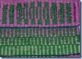
Pick and pick with a colour fade mélange on one set of bars
the warp, but it’s kind of a hybrid that does bars of colour rather then the dots of colours of chene’s and mélanges. And, Always there is the exception that, they can also be woven eccentrically, but the lines or bars of colour follow the fell line follow the  fell line.
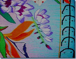
Hatches-informal and formal. All one colour in weft bars or hatches. Note that the bars of create a bridge colour or a third colour. From a distance the colours will optically blend together and create the bridge colour and optically blend as one unit of colour.
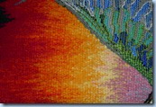 Hachures create triangular shapes of colour that move across the fell line. In the first example the hachures are combined with mélanges. Which adds a greater variety of shading and and colour changes then would be visually available if one or the other technique had been used separately.
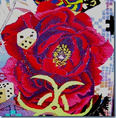
The deep red purples of this flower are done with mixtures of red and purple and then hatched to create a bridge colour between the two different purples and reds mixed on the bobbin
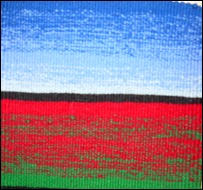
The background and sky are hachures and mélanges that move back and forth to create a mix of colours that when cut off the looms will have the hachures and mélanges pointing vertically after the piece is turned.
Diagrams for these techniques are in the 101 Tapestry and Line and Tapestry .
Time I went back to weaving and preparing for my 4 classes that are coming up in the next month. Who knows maybe we’ll get a chance to visit in person. I will be in the tri city areas in Washington, Boulder, Co, Atlanta, GA, and Mendocino within the next 4-5 weeks.
Cheers and all,
kathe
The dark background I understand and agree.
The fonts….
Hope you find a way to a less tiring font!
The Co. Springs workshops are getting very close. Should be fun. There are several people in the classes that i have known for years from the net, but never physically met.
About the fonts- They are not the ones
i started with in the blog writer program i use. For some reason when i bring them over to blogger eveything shifts-fonts shift, sizes shift, colours shift. What is really interesting is that each time the blog is pulled up it's never the same. The font I was trying to use besides the Lucidia fonts was comic sans. A font that is easy for me to read because i am dyslexic-no serifs to confuse me. Also the reason I use a black background is it doesn't visually bleed out my intense colours or chnge the intensity of the colours.
The fonts in this blog are annoying to me to. I am trying very hard to find away to lock the fonts in place
I really enjoy this post and great pictures, however my eyes have an aversion to this style of font. Hard to explain, but I find it distracting. My problem!
Enjoyed the post Kathe and looking forward to meeting you in one of your Colorado classes.